Thursday, May 30, 2013

Classmate's Style

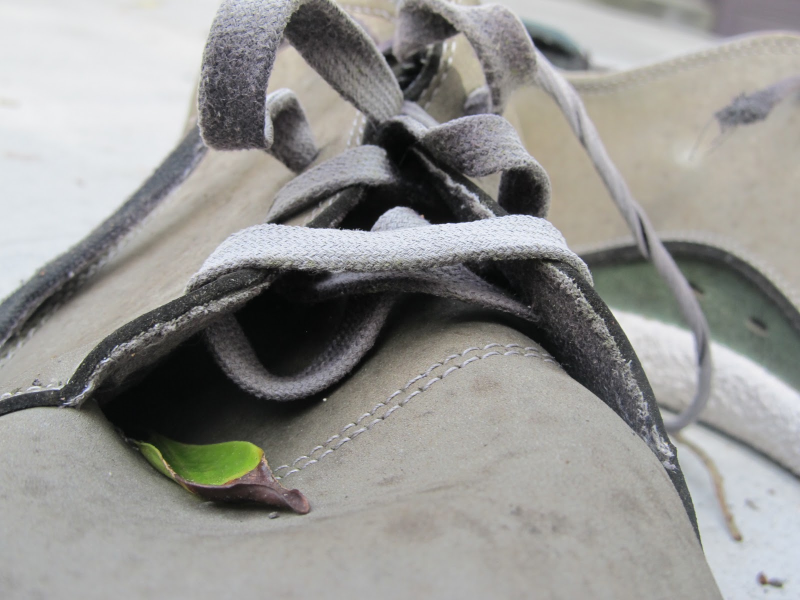
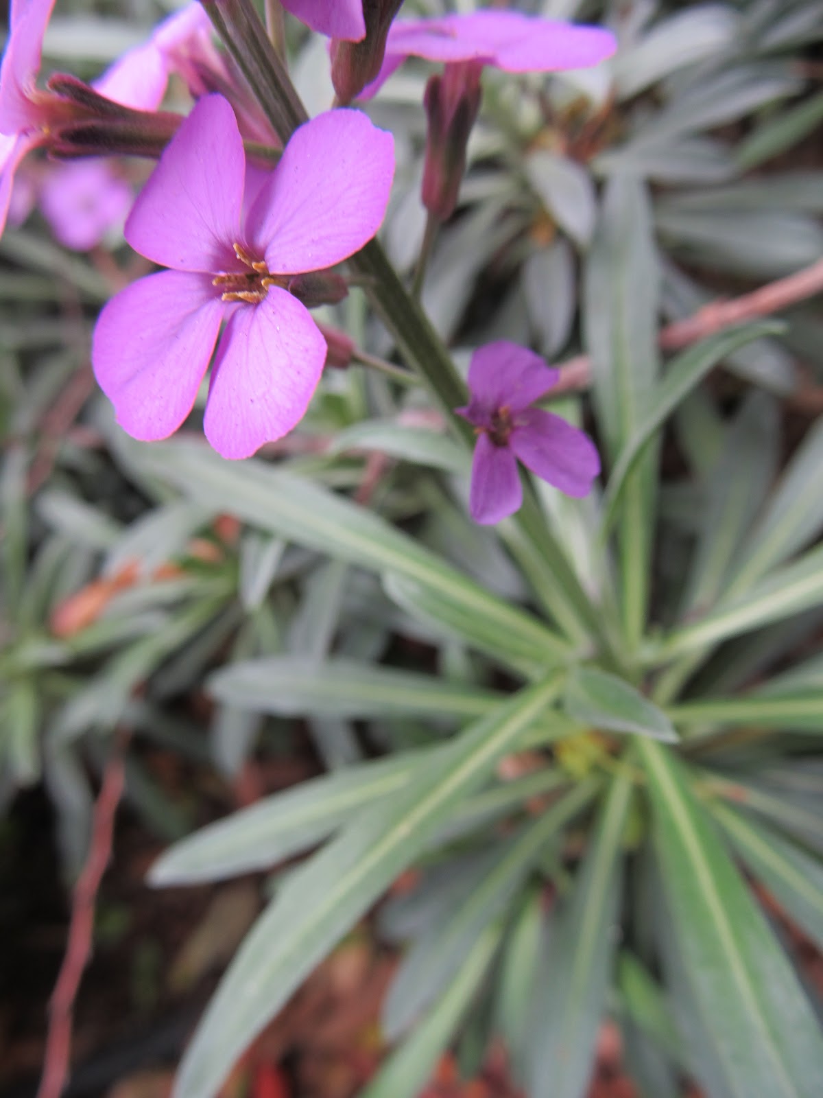
Since a lot of Sebastian's photos focus on plants and nature, I decided to focus on those things too. Since he needed to be in the portrait, I had him be in the background so I can blur him out and focus on the plant. A lot of his pictures also focus on one subject and blur in the background, too.
This photo is similar to Lotus's style because it isn't zoomed up on the subject and it doesn't have any vibrant colors.She usually uses black and white, but occasionally there are a few colors. Her subjects are always off to the side- never in the center of the picture, and are zoomed out. They also have simple or natural expressions, nothing too unique.
For a few of her series, Frankie put/combined two different photos into one. I thought the barrier kind of made this picture look like two different ones; one picture of Frankie combined with one of others socializing. Like Lotus, she often takes photos farther away from the person.
A lot of Benji's portraits are up-close shots of someone, who usually aren't looking directly at the camera. He also uses black and white a lot, and the model has a somewhat blank or simple expression.
Kurt like to make/have his photos contain a lot of blue and black. Usually people use just black and white, but a lot of his pictures I saw were mainly or only blue and black (a darker background). He also enjoys taking blurred pictures, so I used motion in this portrait of him and Photoshopped it so that it was more grey with a bluer background.
One of the biggest styles Alex uses is texture. A majority of her photos have one or more texture layered on top of the original photo. In this photo, I took a somewhat unique pose (like she does), took a picture of the carpet, and layered on top of her.

Friday, May 17, 2013

6 Favorite Photos of the Semester

This is one of my favorite photos of these six; it was the one I used in the art show. I really like the coloring in it, it makes the picture look old, as well as the flower being dead. I had named this piece "Fallen Dancer" because it reminds me and other people of a dancer on the ground.


I like this photo because it's really simple, and the coloring is all similar aside from the bright green leaf. I also like how there is so much detail on the shoe, especially in the shoelaces.
I like this photo because the purple petals really stand out among the rest of the less-vibrant green.

I'm mot really sure why I like this picture so much; I guess it's because of the detail in the pavement and that it is so simple.

I like how the colors in this photo are so bright but soft. The highlights on the bar are what really soften the feel and look of the photo.

My favorite part of this photo is the rust on the battery, mainly because the coloring goes well with/matches the color of the mulch.

Thursday, May 2, 2013

Flower Series

This is a budding flower; you can see so much detail and how the red stands out from the green.
Like the first photo, I tried to capture one bright color (in this case the purple) surrounded by green. The flower looks soft in this photo, but sharper than the leaves underneath it.

I like how the flower is sort of shaped like half a sphere, or a cup. The fading purple on the leaves are really beautiful, too.

The flowers stand out so much in this photo; and I think the combination of the blue of the flowers and the brown sticks/twigs is really pretty.
This is a close up of the other picture. In this, I made sure that the sticks blurred so the attention would be directed to the flowers first. By doing this, the small details on the petals are much more noticeable.
There is a lot of red in this photo, which makes the white flowers be the first thing noticed in this photo. With all of the red in it, it kind of looks like the photo was Photoshopped so it would get redder (which it wasn't).
This was a very unusual-looking and kind of destroyed flower. Most of the petals had been ripped off, but what remained of it was vibrantly colored.

This is one of my favorite flowers, because I love the various shades of purple on the petal. It's a;so interesting how three of the petals are beautifully patterned, but one is just one shade of purple.
I Photoshopped this originally yellow flower to be purple, so the coloring of the tulip is unusual but very vibrant at the same time.
The tulip looks like it's floating because you can't see the stem in this view.